Laura de Santillana lives on an island, a densely populated wisp of land called the Giudecca that is part of the Venetian archipelago. Her home place is blasted with sunlight, to the degree that filmy curtains or louvered shutters are essential for comfort—both to lower the intensity of the light and to lower the temperature. Both of these descriptions would also fit Japan, which may explain her visual and emotional sympathy for a place very far away from her everyday life.
It’s also interesting to think about the differences between the two environments. Japan’s sunlight is moisture-laden, and deep shadows are appreciated as much as bits of reflection that sparkle in the dark. Italy’s light is dry and transparent, and shadows do not seem so deep. Another sharp contrast is that Japan’s traditional residential architecture was often dark, thin and ephemeral, whereas Italy’s was light-colored, thick and long-lasting.
Of course, both countries embrace self-contradictory features as well. As simple as an Italian farmhouse might be, the architectural style for which the country is most famous would surely be the Baroque. As reductive as Zen taste is, Japan also has its version of Baroque, as exemplified by the Tōshō-gū Shrine at Nikkō, Oribe ceramics, and the mix of patterns in obi and kimono.
But even if these home influences are crucial, truly original work is not the consequence of the artist’s early surroundings. It emerges out of an individual’s imagination. Her work is not characteristically “Italian” nor is it typical of contemporary glass. It is simply her own.
One might suppose that the simplicity of her forms could have been influenced by postwar abstraction, both in design (her family’s business) and in the painting she might have seen in Italy or in New York during her period of residence there. I’ve always perceived a certain kinship of her work to the floating color fields of Mark Rothko’s paintings. But de Santillana’s colors are more consistently subtle, and of course she makes use of the distinctive translucency
of glass, and luminescence may seem to surround her works. This character makes a play-on-words of her name in English. Instead of her personal name being pronounced as in America, loh-rah, it is pronounced la-aura, and indeed her work creates an aura of light and color.
It’s easier to speak of the work in terms of painting than in relationship to other work in the glass field. The translucence of her glass recalls but exceeds what oil paint can achieve, yet her fields of colors still recall painting, as does her emphasis on edges and, in some of the new work, on the definitive quality of line—particularly in the sinuous lips of the compressed vessels. But however painterly, the works remain three-dimensional at all times; she plays with foreground, background or indeterminate planes of color so that they always convey relief, and thus a third dimension. The vessels also communicate time as they imply that they were once round volumes but have now yielded to gravity and pressure through circumstances we can guess
about.
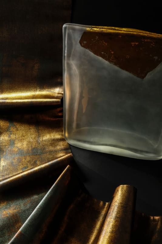
Most of all, de Santillana creates extraordinary effects of gradual change, of tentativeness, of subtlety. Her gold does not glitter but softly radiates or makes a hesitant line. Her blue is a tranquil depth. A silver band seems tenderly tarnished with age or abrasion. An intense green color relates to the palpability of nature. At the same time, the forms of most of the works relate to the order and obviousness of geometry. The forms begin as cylinders but as they begin to melt and compress in the kiln, the rectangular outline becomes dominant. This rectangularity contributes to the serene feeling her work communicates. Its familiar structure and sense of order create a stable basis for the gentle curves and deflections of the sculptural
surfaces.
That unmistakable structure also contributes to the most extraordinary contrast in de Santillana’s work: the unexpected play of quietness against power. The power comes from the clarity of form. The simple shapes have only sensuous undulations that set viewers’ eyes in motion to visually caress the forms without being interrupted and distracted by sharp diversions. Yet undermining that clarity is the mutability and softness of the color passages. Gold or silver leaf on a gray or black vessel sometimes seems to dissolve into a levitating expanse of texture that makes an impression rather than a declarative statement (and completely lacks another frequent characteristic of painting, the personal brushstroke as a kind of signature of the artist). The form looks solid and heavy and sits unequivocally on the floor or pedestal that supports it, but the color blocks float, dreamlike, in space. Even within the color blocks—especially the gold and silver leaf—hue is gently mottled to the degree that it seems less like a surface than like a view into water or fog. We cannot be entirely sure of where it is or where we are. It is never just one thing, but a gathering of imaginative possibilities.
This extraordinary blend of power and tenderness could probably be compared to many things in nature or in art, but to my mind it evokes not just Mark Rothko’s paintings, as mentioned, but also Toko Shinoda’s large-scale calligraphic installations or walls and doors. And here, maybe, we can elaborate on the aesthetic connection that makes de Santillana’s work so sympathetic to a Japanese setting. It is her appreciation of reserve, emptiness, quiet, simplicity, and her recognition that these qualities of limitation are neither timid nor boring but powerful in themselves. In this exhibition they combine exquisitely with the textiles of Kondaya Genbey, which also take a simple format and subtle colors but in his case combine it with the fine details of representational imagery drawn from nature. De Santillana creates the atmosphere, and he populates it—with anything but the human image. We viewers furnish that, as we celebrate the beauty and accomplishment of all this work.

